See how that works? One selects ‘call a phone,’ thinking perhaps it is contact information, when it’s really a colophon (of sorts). Welcome to life in Finnegans Wake.
Sum Mer de le Wake is built using the Imbalance 2 WordPress theme. The default font for that theme, unchanged here until we decide to pony up for a premium upgrade, appears to be Helvetica Neue, which will then devolve its way down to Arial, depending on the fonts available on one’s machine. Published almost 20 years after Finnegans Wake, the original Helvetica was at least designed in Switzerland, not far from Zurich, where Joyce twice lived to avoid a World War.
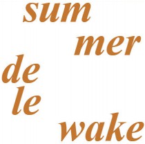
For all typography within imagery — when not hand-done, anyway — the Gill Sans and Times New Roman families are used. Each was in use when the Wake was published and is largely used here for that reason — though it must also be admitted that the designer has also not been able to explore these extensively in other designs and relishes the opportunity.
The original intention of this site was to be all about the content, but who are we kidding? The design, like the content and mission, will continue to evolve.
